Project overview
Architecture websites often lean toward the clinical – sterile, high-contrast galleries that prioritise the structure over the inhabitant. For London-based studio Benjamin Wilkes, whose practice seamlessly blends the structural rigour of architecture with the tactile, lived-in warmth of interior design, the intent was the exact opposite.
This multidisciplinary approach, paired with their own distinct creative vision, meant they required a digital home that broke the industry mould: a space that is undeniably professional, yet warm, inviting, and deeply human.
Brand sector
Architecture & Interior Design
Project scope
Web design, Web development
Tech architecture
Figma, Webflow, Custom code
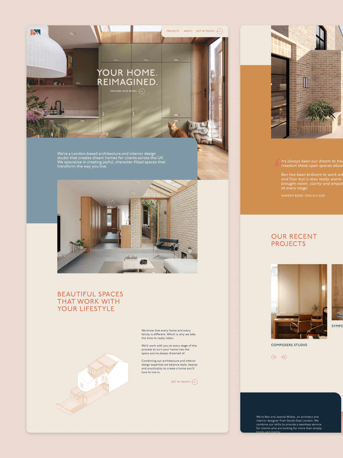
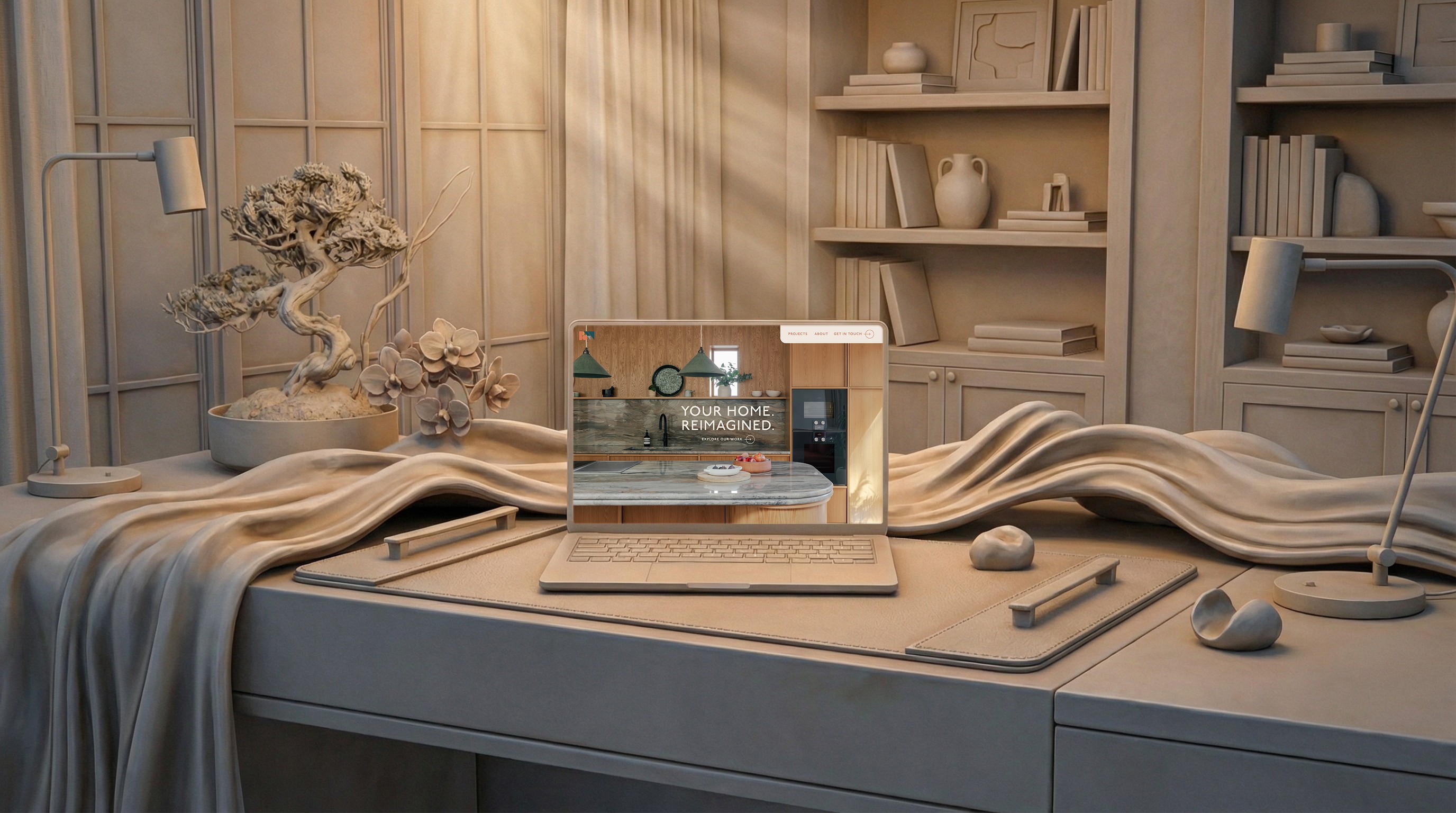
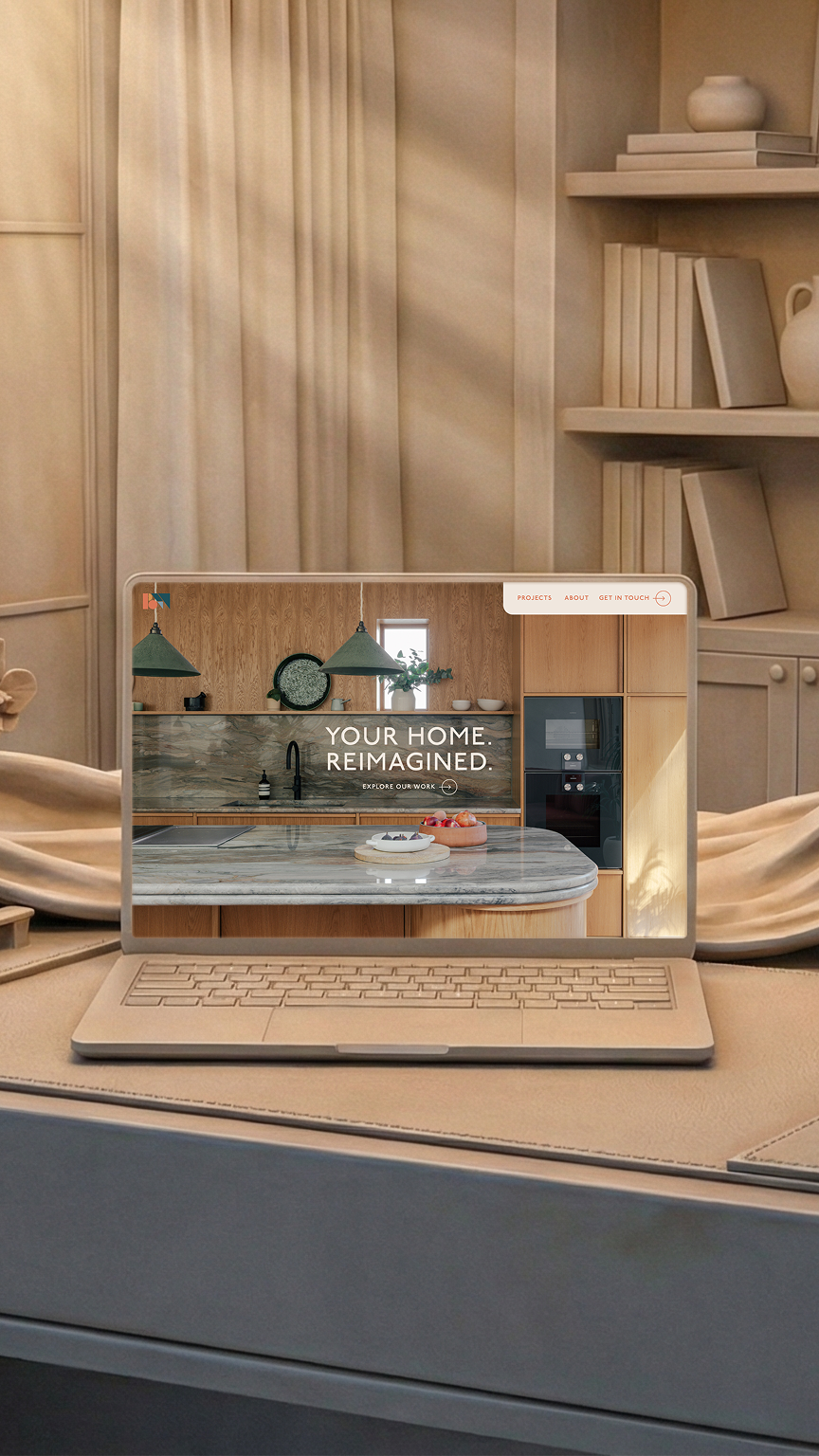
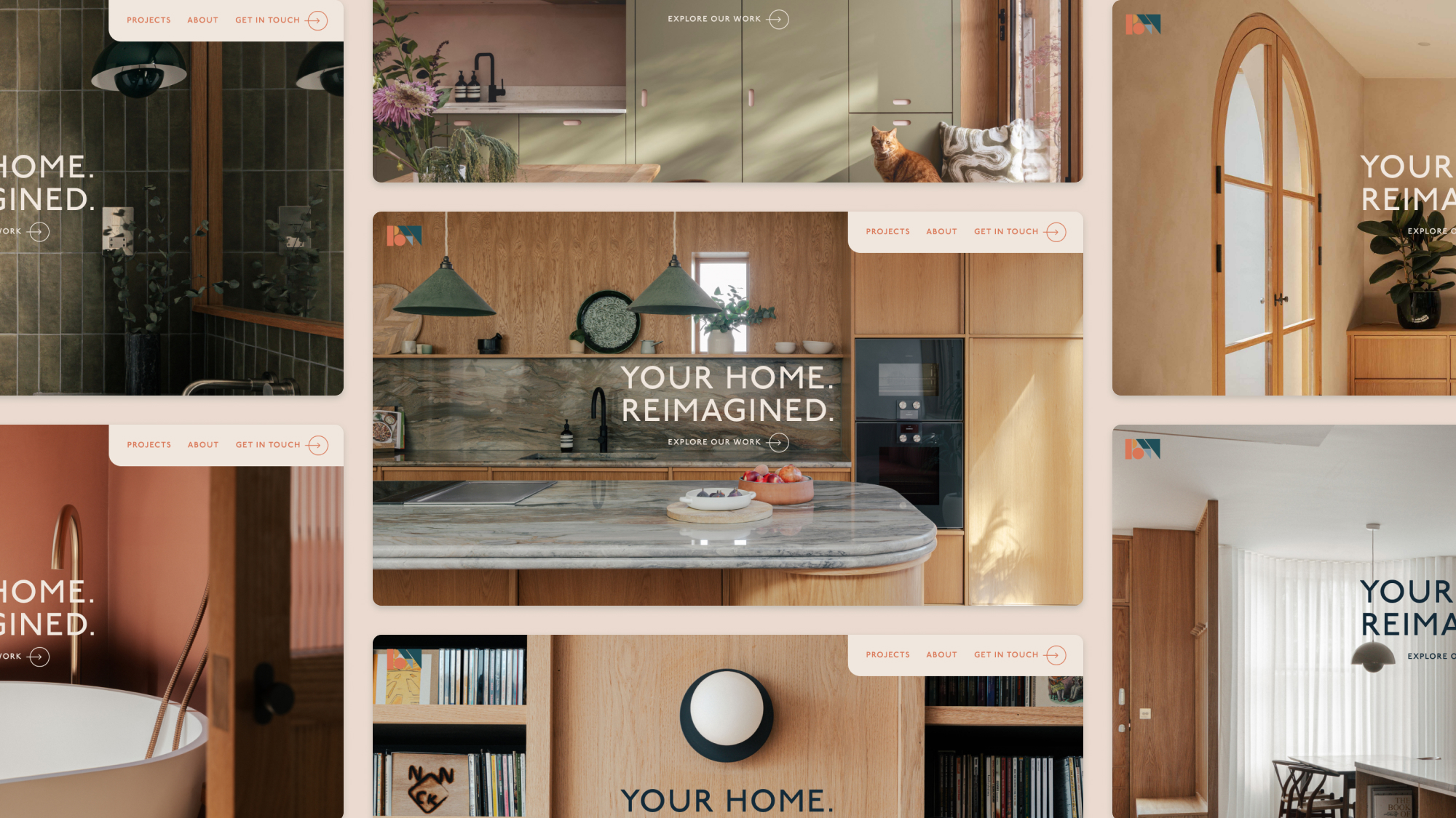
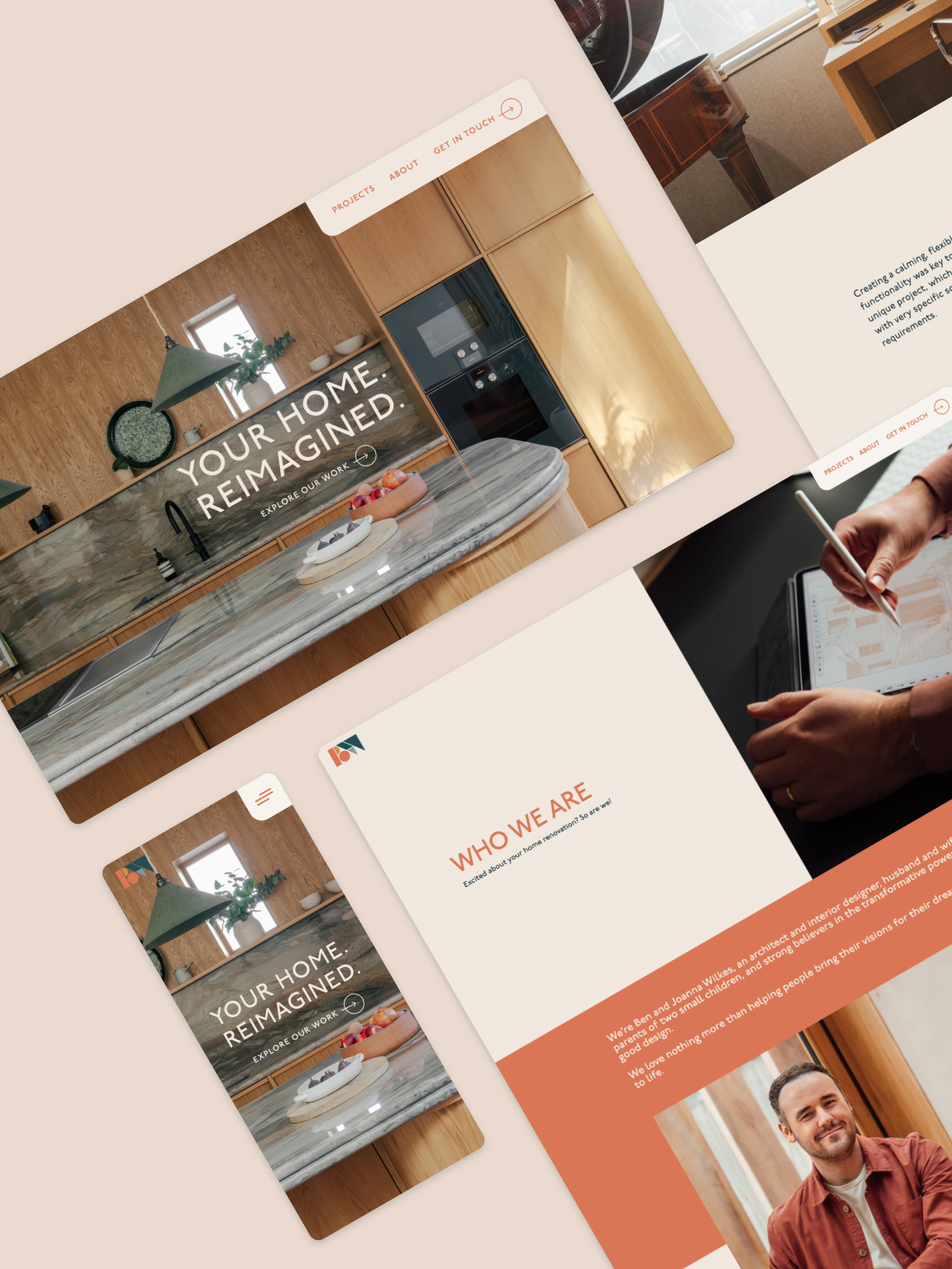
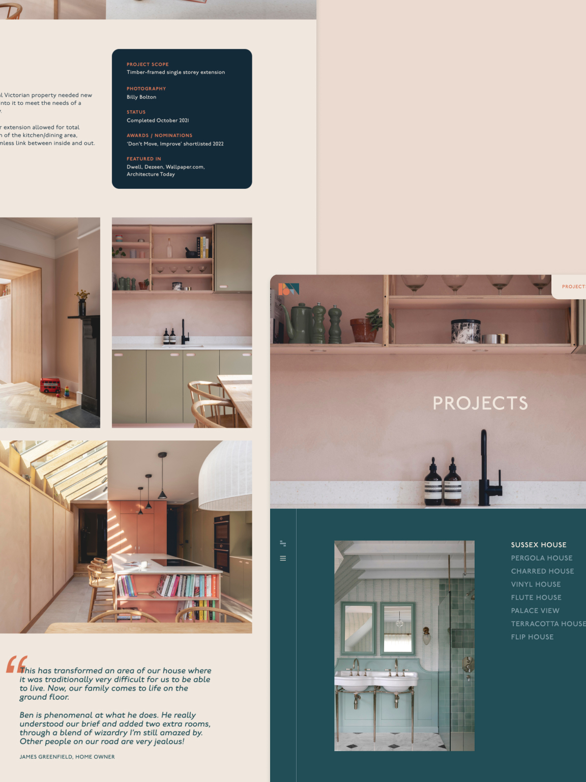
We challenged the industry’s “clinical” status quo by designing an environment defined by a sense of arrival. Crafted in Figma with a focus on rhythmic intentionality, the layout avoids the typical portfolio grid in favour of a segmented experience that feels both fluid and grounded.
This began with a vibrant interpretation of the Benjamin Wilkes branding; where others might opt for sterile monochrome, we leaned into their signature use of bright colour to build a cohesive visual thread. These hues serve as intuitive markers, highlighting key sections and anchoring the brand’s identity within the digital space.
Working alongside Sarah Matthews’ thoughtful copy, we ensured the visual narrative feels like a conversation rather than a gallery – comforting, reassuring, and curated with a human touch.
To bring this vision to life, we utilised Webflow to build a solid, functional foundation that is as vital as the view. The technical implementation focuses on “the unseen” – ensuring a high-performance build that supports high-resolution imagery without friction.
To maintain a sense of vitality, we integrated a dynamic hero system where images rotate upon each page refresh, keeping the entrance to the site feeling perpetually fresh and engaging for returning visitors.
Subtle, discovery-led animations are hidden throughout the site, rewarding the visitor’s curiosity and adding a layer of sophisticated motion that feels organic rather than performative.
Project highlight
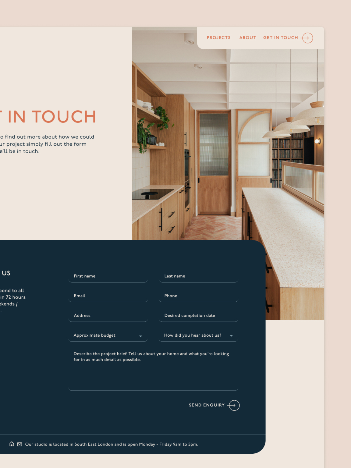
The point of contact is frequently the most overlooked architecture of a website, often relegated to a standard template. For Benjamin Wilkes, we treated the enquiry process with the same editorial care as the hero gallery.
We designed a custom system that is as visually cohesive as the rest of their website, yet engineered for deep efficiency.
By streamlining the initial intake, we ensured the website functions as a silent studio manager, reclaiming valuable time for the founders to focus on their craft.
The result is a digital landscape that echoes the experience of walking into a Benjamin Wilkes home.
We designed a rhythm that rewards exploration, allowing visitors to become fully immersed in the portfolio before being invited to partner. It ensures that by the time an enquiry is made, the client is already deeply invested in the studio’s unique approach – making the transition from observer to collaborator a natural, intentional next step.