Project overview
Matthews Interiors is a study in “new name, old soul.” While the company itself was a fresh venture in the Midlands, its provenance is deep-rooted – anchored by a 40-year construction heritage and a third-generation passion for the craft.
For founders Wes and Dean, this unique position required a digital presence that didn’t just announce their arrival, but substantiated it.
We were tasked with creating a home that bridges the gap between high-stakes commercial capability and the intentional care of a boutique family firm, positioning the venture with the weight and authority of an industry leader from the very first interaction.
Brand sector
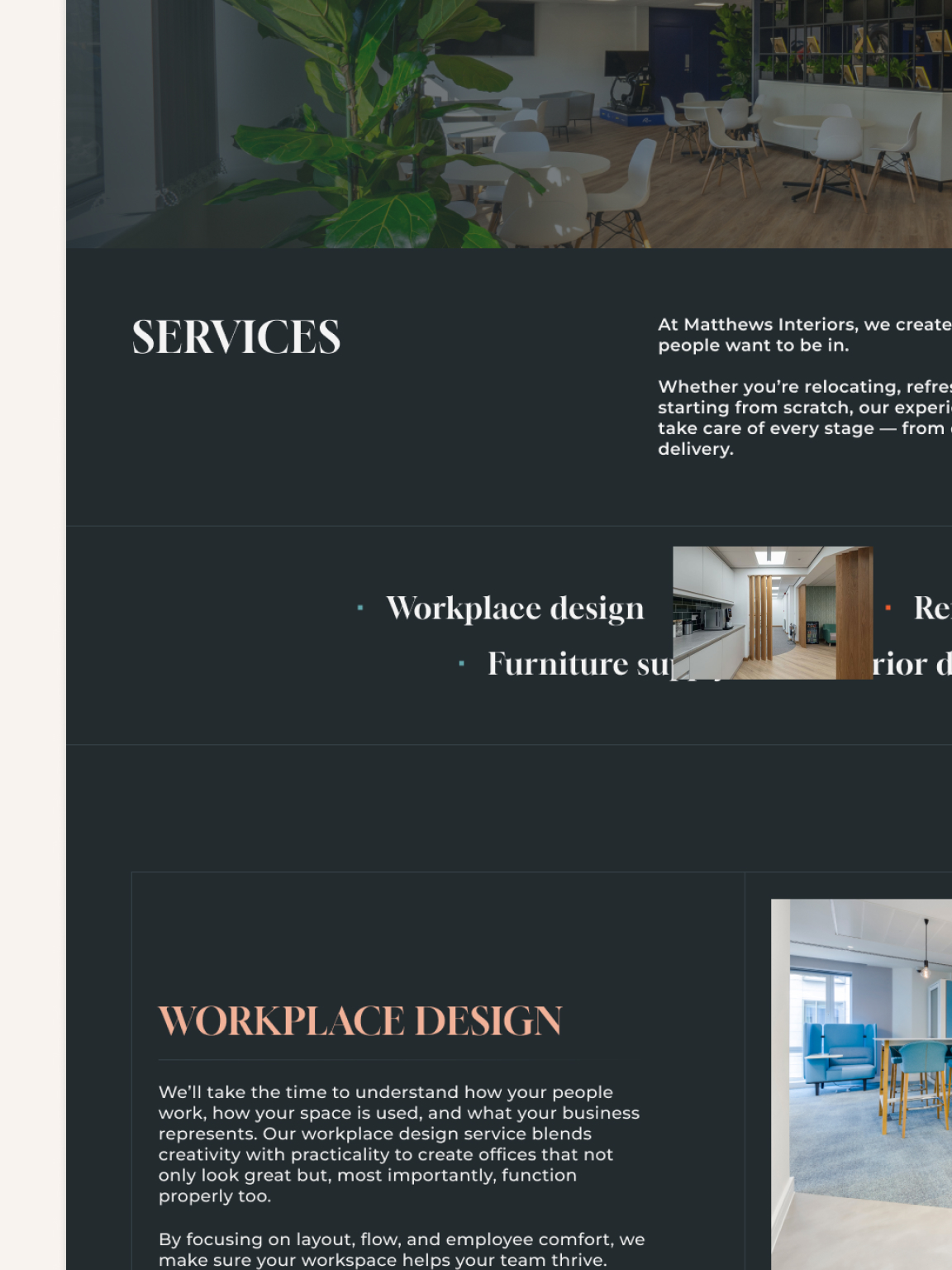
Commercial Interior Design & Fit-Out
Project scope
Web design, Web development
Tech architecture
Figma, Webflow, Custom code
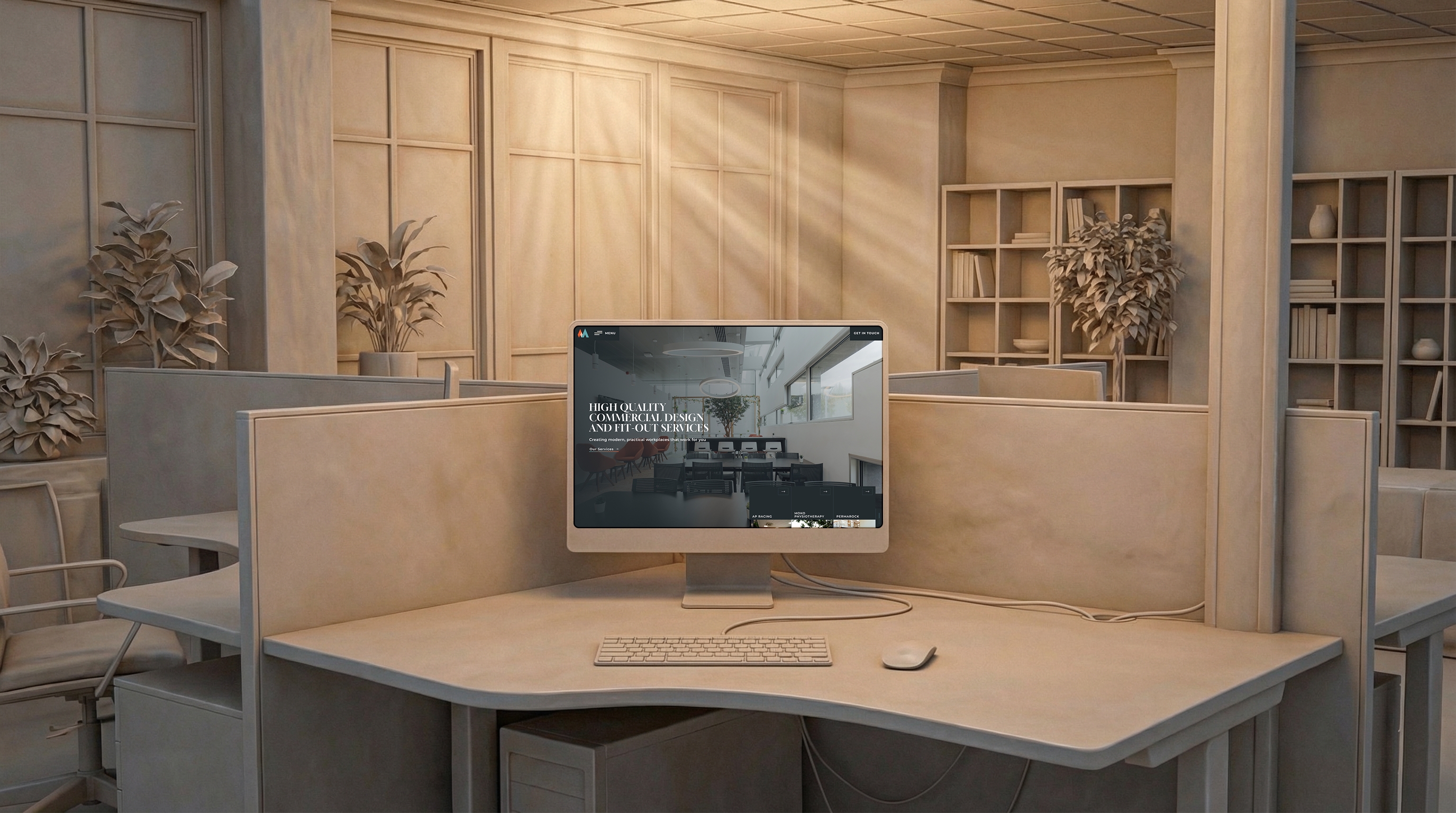
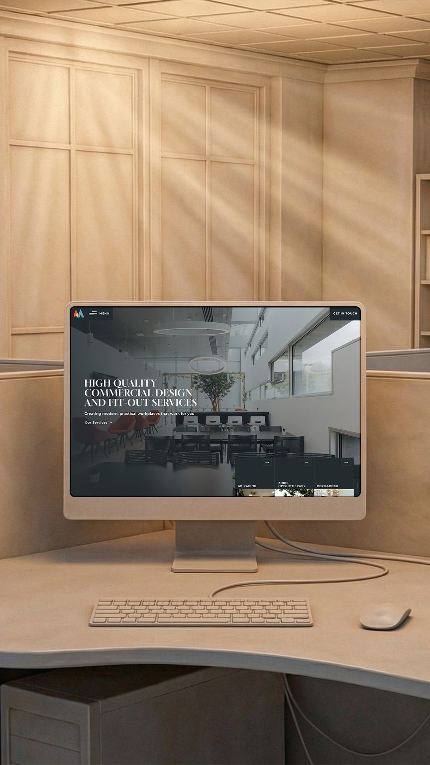
The visual direction was driven by a need for immediate trust and architectural depth. We moved away from the generic, high-visibility aesthetic of traditional contractors, opting instead for a dark, premium palette that feels both sophisticated and permanent. This is paired with refined serif typography to ground the brand in a sense of professionalism and heritage.
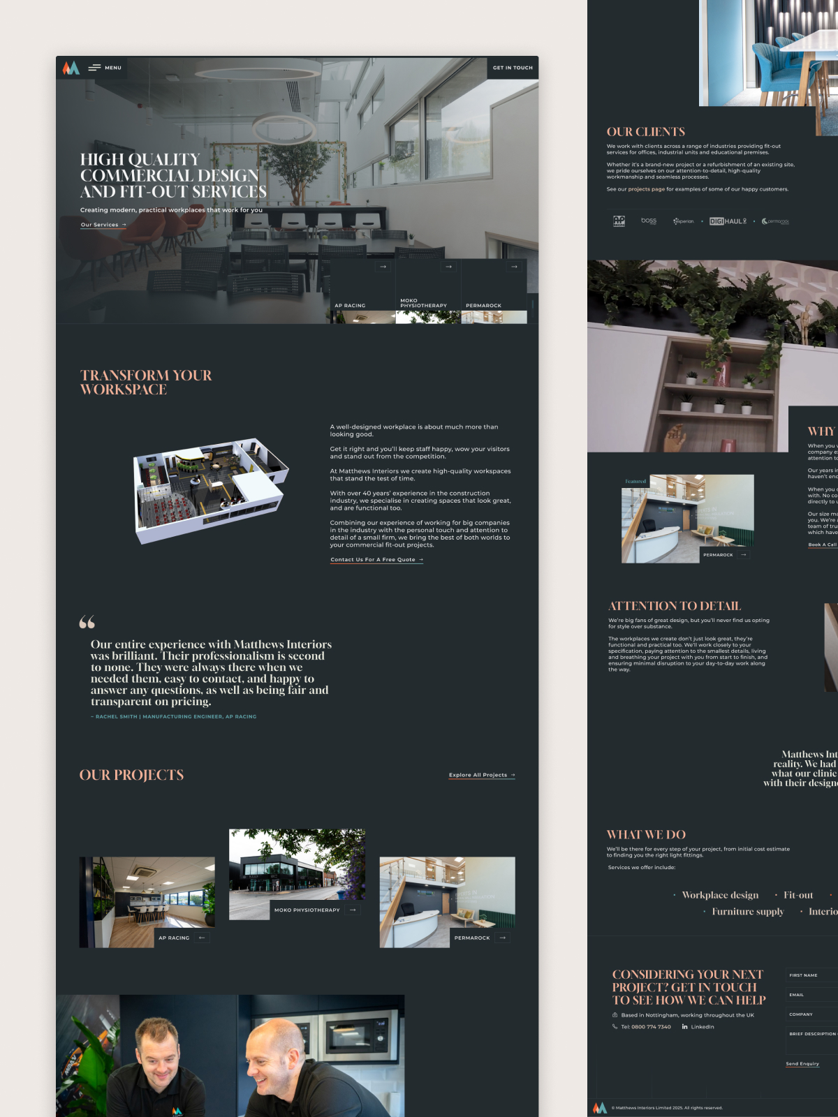
The layout itself is a deliberate balance of tension and release; we utilized spacious, asymmetrical sections alongside more structured grids to mirror the duality of their work – the creativity of Interior Design and the rigour of a physical Fit-Out. As visitors move deeper into the scroll, a silent, 30-second cinematic sequence is strategically placed to add intrigue and showcase the tactile reality of their projects without breaking the calm, intuitive flow of the page.
Behind the “quiet confidence” of the interface lies a high-performance Webflow build. The site is engineered for speed, ensuring that the large-scale, eye-catching imagery that defines their portfolio loads with absolute clarity across all devices.
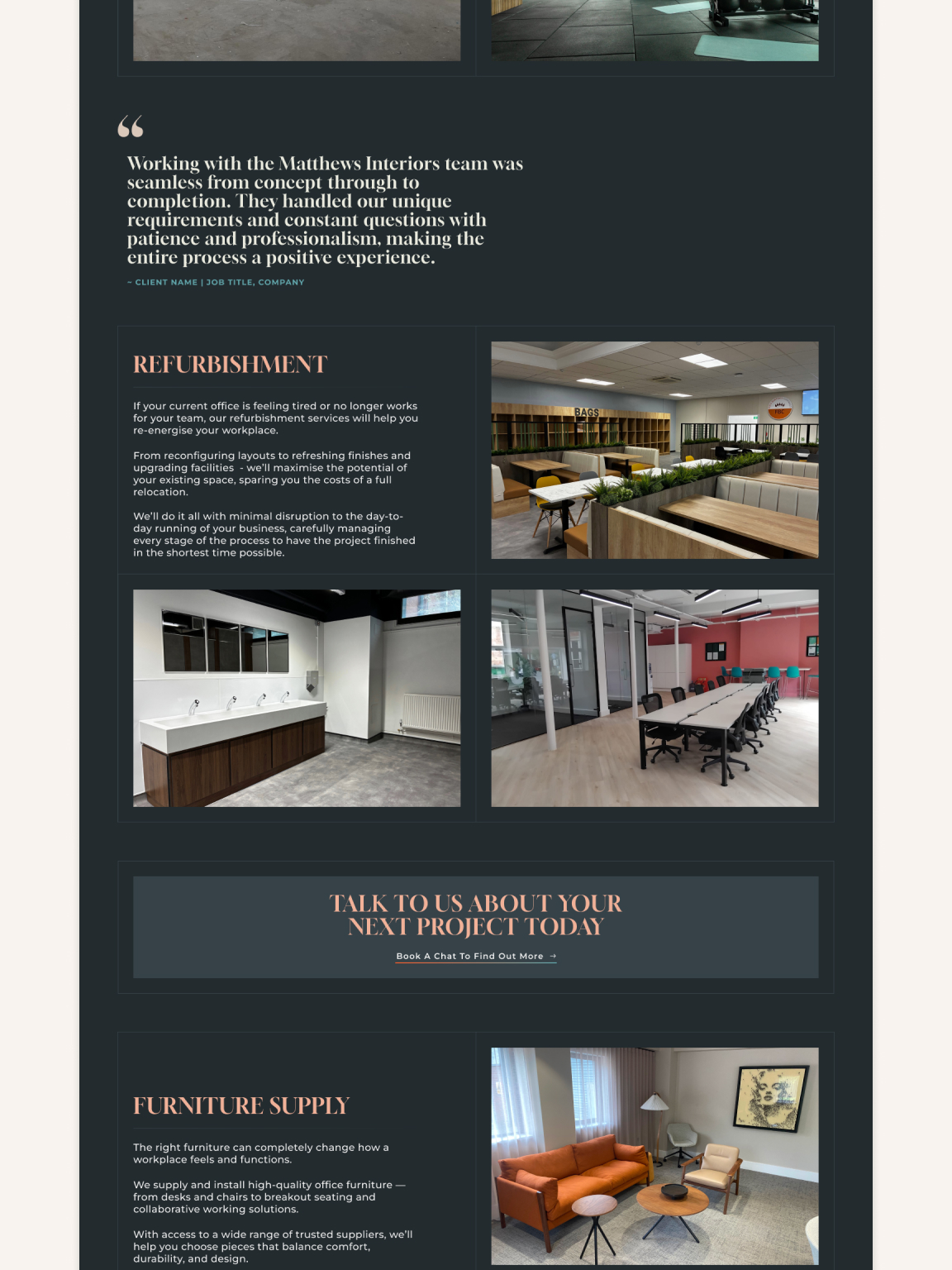
We treated social proof as a core structural element. Testimonials and client logos are woven directly into the fabric of the homepage and project pages, creating a continuous narrative of validated expertise.
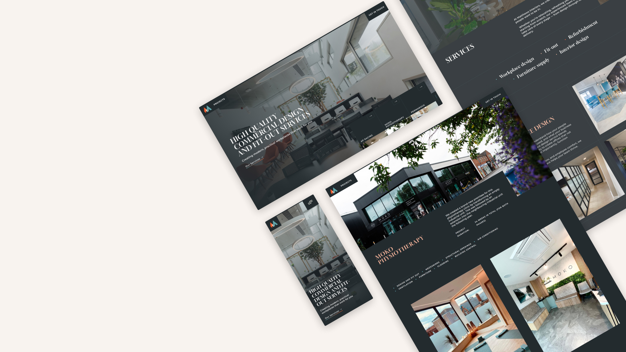
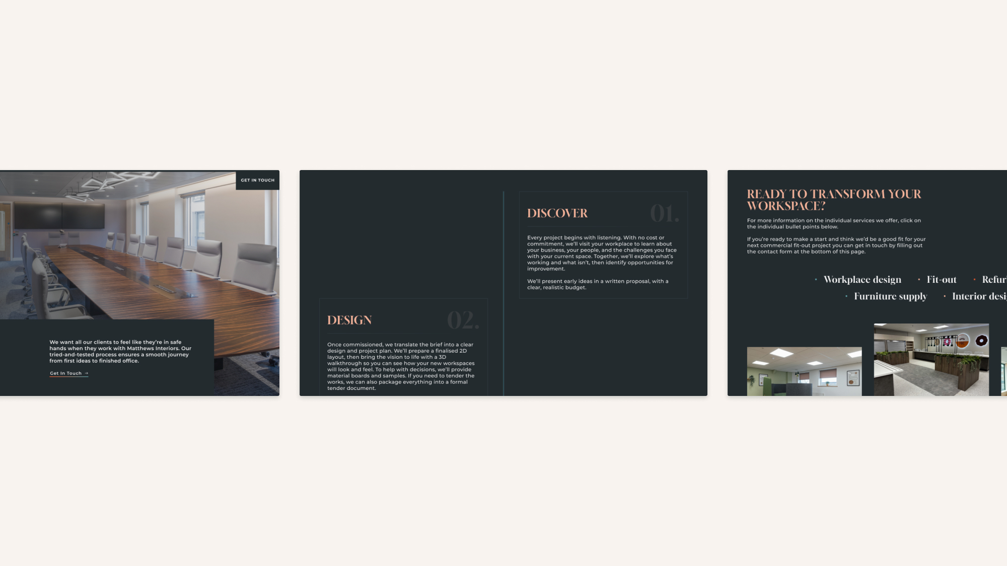
The site navigation is equally purposeful; from the hero section, visitors are met with immediate access to their latest projects, leading into an expansive CMS ecosystem where each individual case study is treated with editorial care.
Project highlight
To showcase the specific “Design & Fit-Out” journey, we introduced tactile interactions that reward the visitor’s curiosity. In the services section, a hover-animation triggers specific project imagery, providing a visual shorthand for their multifaceted capability. This intentionality carries through to the Process page, where we designed a custom scroll-progress bar that fills as the user moves down the page – a digital representation of a project moving from the initial CAD concept to the final, physical handover.
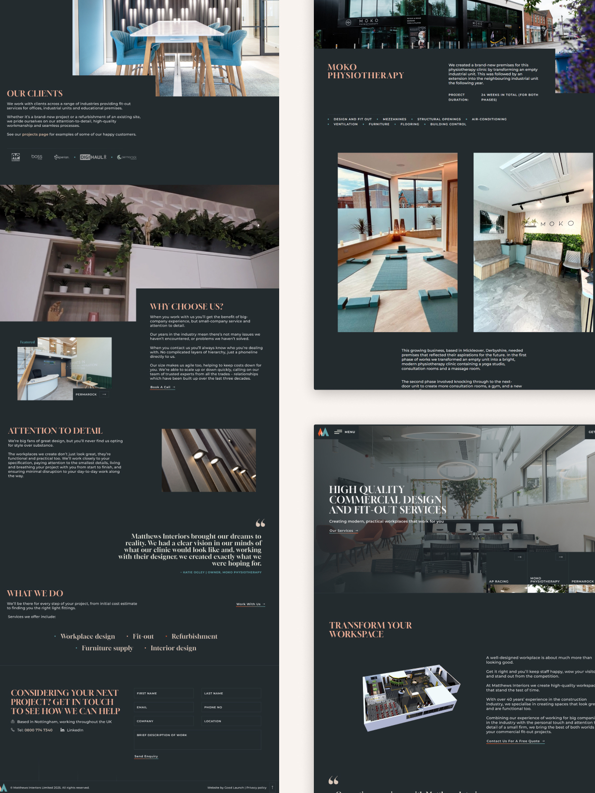
The result is a digital landscape that feels established, confident, and entirely ready for growth.
It provides Matthews Interiors with a platform that mirrors the founders themselves: small but mighty, and thoughtful in every detail.
By the time a visitor reaches the contact page, the transition from observer to collaborator feels like a natural, intentional next step, backed by a clear understanding of their process, their people, and their 40-year legacy.